Getting Started
Signal21 is a charting platform with direct SQL access to underlying data. Charts are organized into dashboards, which can be customized. The platform is designed to be user-friendly, with a simple interface that allows users to easily create and share charts.
There are two ways to execute SQL queries in Signal21: https://app.signal21.io/query and through the API.
The website and API utilize the PostgreSQL dialect for the Stacks backend and Clickhouse for the Bitcoin backend. For more detailed information, please refer to the official PostgreSQL documentation and the Clickhouse documentation.
Only the SELECT statement is supported for both backends.
For the complete list of tables look at Stacks Tables and BTC tables.
Custom Dashboards has examples of queries that can be copied and pasted (or “played”) into the query editor.
Query Editor
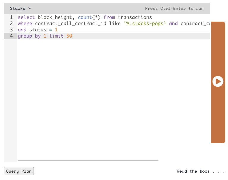
Query Editor allows users to write and execute SQL queries. The editor is divided into three sections: the query input, chart selection and the results area.
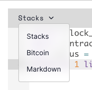 First, select the backend from the dropdown menu. The options are “Stacks”, “Bitcoin” and “Markdown”. Then, write the query in the input area.

Click the “Run” button to execute the query.
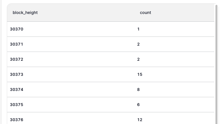
The results will be displayed in the results area.

The chart selection area allows users to choose the type of chart they want to display. The options are “Table”, “Line”, “Log Line”, “Pie”, “Bars”, “Information Card”, “Area”, and “Treemap”.
Chart Types
Table

The table chart displays the query results in a table format. This is the default chart type.
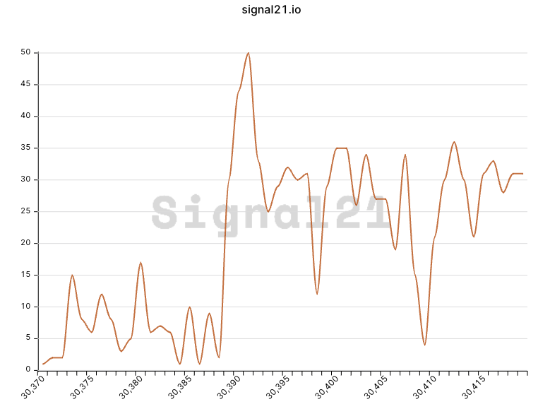
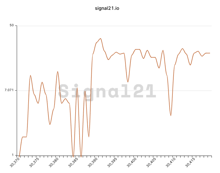
Line

The line chart displays the query results as a line graph. The x-axis is the first column in the query results, and the y-axis is the second column. If the first column is a timestamp named “ts”, the x-axis will be a time series. It will be always presented in ascending order if “ts” is ordered.
Log Line

The log line chart is similar to the line chart, but the y-axis is displayed in a logarithmic scale.
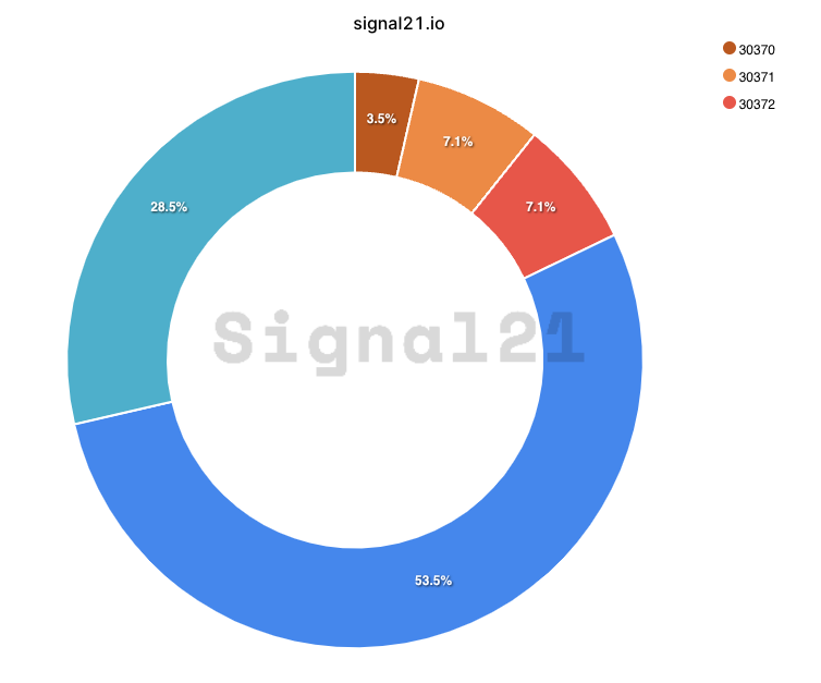
Pie

The pie chart displays the query results as a pie chart. The first column in the query results is the label, and the second column is the value.
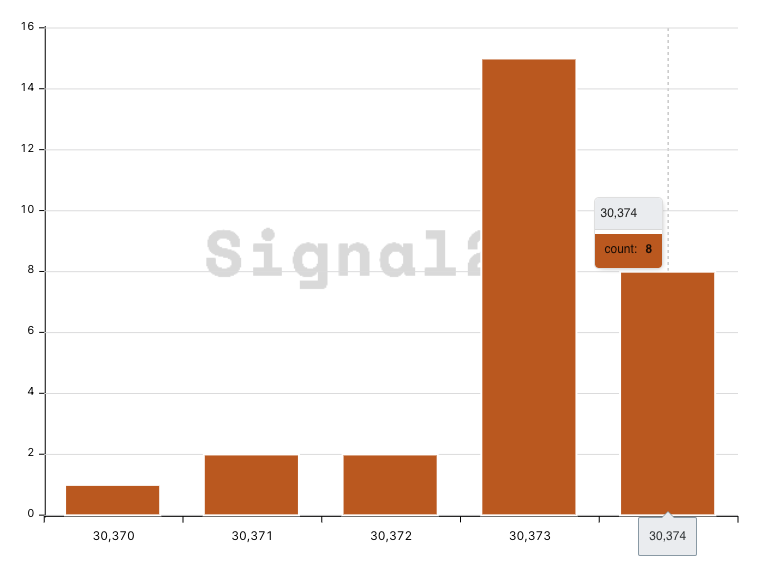
Bars

The bars chart displays the query results as a bar chart. The first column in the query results is the label, and the second column is the value.
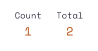
Information Card

The information card chart displays the query results as a single value. Only first row will be displayed. Each column will be displayed as a separate section in the card.
select 1 as "Count", 2 as "Total"
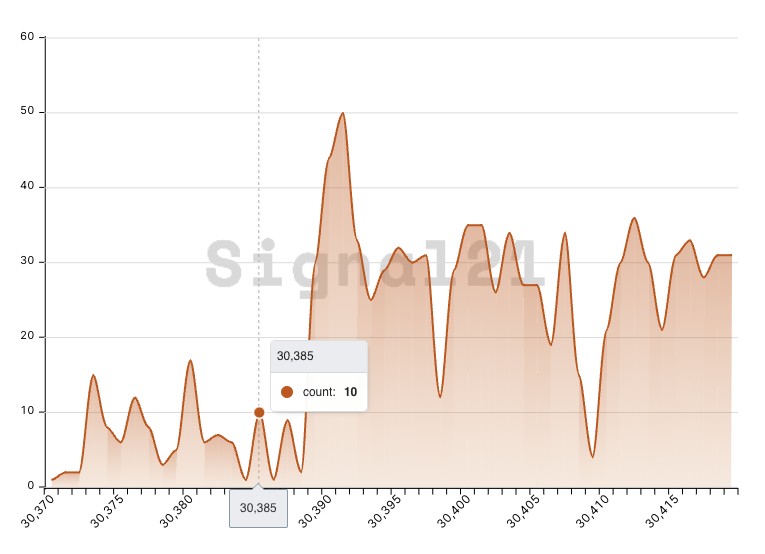
Area

The area chart displays the query results as an area graph. It is similar to the line chart, but the area below the line is filled with color.
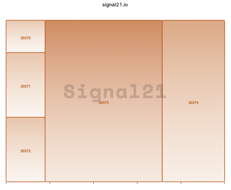
Treemap

The treemap chart displays the query results as a treemap. The first column in the query results is the label, and the second column is the value.
Saving Charts
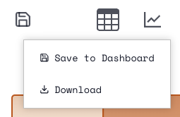
Click the “Save” button to save the chart. The chart will be saved to the dashboard. It can be saved into existing dashboards or new dashboards.